Under the covers... Pink Floyd's Dark Side Of The Moon
Apiece of art that can today be found in 45m homes around the world was kick-started by a simple, none-too-detailed instruction to 'do something clean, elegant and graphic'. The instruction came from Pink Floyd keyboardist Rick Wright, and was given to Storm Thorgerson and Aubrey Powell, the founders of Hipgnosis, a London-based art and design group whose first sleeve design had been for the Floyd's 1968 album A Saucerful Of Secrets.

Hipgnosis had earned their spurs creating innovative covers for The Pretty Things, Free and several others, but this particular 1973 design would rocket them to the position of probably the most admired and in-demand independent rock imagineers in the creative world.
The Dark Side Of The Moon was the Floyd's eighth album, and they'd started work on it in May 1972. Effectively, it was a suite of songs built around the concept of aspects of life that drive people to insanity, and was widely perceived as the band's homage to their original leader, Syd Barrett, who had fallen foul of his abuse of psychedelic drugs and had to leave the band as a result.
Barking Mad
Thorgerson Told Mojo in March of 1998 that 'I'd had conversations with the band about what they wanted on the sleeve. [Floyd co-founder Roger Waters] explained the intellectual thrust of the music, the theme of madness – the madness of rock 'n' roll and madness in general'. Nevertheless, it was Wright's blunt instruction that provided the real impetus. 'He basically said, "Let's have no f***ing pictures this time. I'm bored with pictures". I was quite taken aback because he was so definite about it.'
Hipgnosis had long since established the idea that Floyd album covers would not feature the traditional images of handsome young men, but Dark Side offered them an opportunity to move even further away from record company dictates and expectations. Being employed directly by the band, rather than by the label, also conferred on them a freedom rarely enjoyed by other sleeve designers.
They presented several possible sleeves to the group. 'We did six or seven complex roughs of all sorts of different things that were eminently suitable', remembers Thorgerson. Pressed for more details, however, he rarely recalls any of these alternatives, except one which featured the Marvel Comics character The Silver Surfer.
'We were excited and looking forward to showing these different ideas to the band.'
Light Fantastic
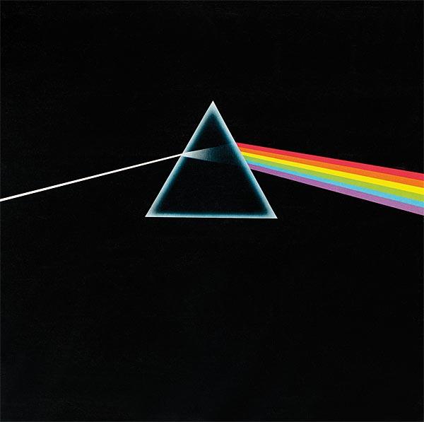
From the start, though, their design showing a prism with a ray of light being refracted through it was the clear favourite. 'They took all of about three minutes', Thorgerson has recalled. 'They just looked at each other, said, "That's the one. Right, we're going back to work". Then they went back to the studio.'
The origin of the image had come from Thorgerson remembering a monochrome illustration in a book of photographs showing the process of light refraction through a glass prism. (Intriguingly, Hipgnosis had previously suggested such an image to Charisma Records when it was planning on launching a new label, Clearlight. Fortunately for Pink Floyd, the label never happened.)

Thorgerson's memory was made real by graphic designer George Hardie, a Hipgnosis collaborator, who has revealed, 'I drew a line artwork and indicated colours using percentages of magenta, cyan, yellow and black from a printer's chart... The lines act as the edges of each colour and the printer fills in the colours.'
It is undeniably Hardie's image that first comes to mind when Dark Side Of The Moon is mentioned among music buffs, but that was far from where the process of creating this classic sleeve ended.

Heart Of Darkness
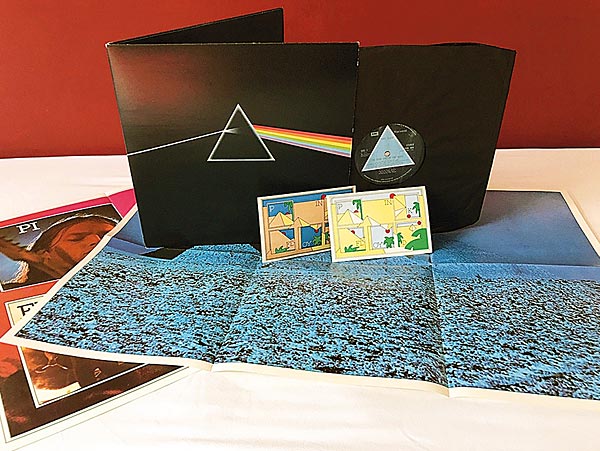
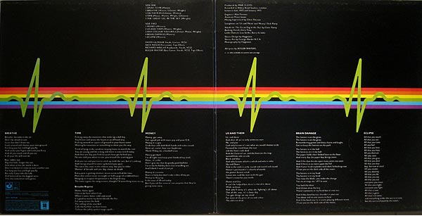
Given that the sleeve was to be a gatefold, Roger Waters suggested that Hardie's image should extend across the gatefold and that the inside sleeve should include an illustration depicting the blip of a heartbeat as it would appear on a hospital monitor. Thorgerson has confirmed that, 'It was Roger's idea to turn the light into a heartbeat inside the sleeve – the sound that starts the music'. By this simple device, the music became integrated with the cover art.
|
| |||||||||


| Equipment Reviews | Music Reviews Awards | Latest News Features | Resources Newsletters | Subscriptions |
WHERE TECHNOLOGY BECOMES ENTERTAINMENT
 © 2026 Hi-Fi News
AVTech Media Ltd
All rights reserved