Under the covers... Roxy Music
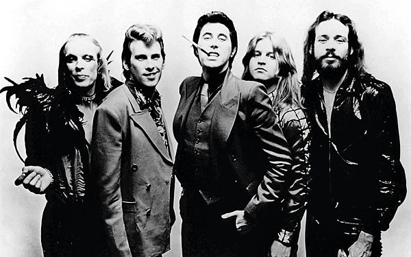
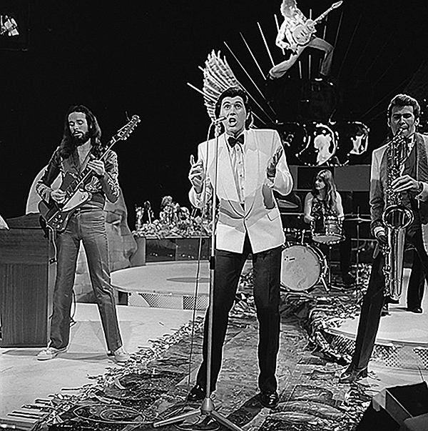
If ever there was a band that arrived on the scene fully formed, it was Roxy Music. Before they were even signed to a label, they had a startling, glitter-flecked, faintly androgynous image, and a unique hybrid sound. This blended stomping glam pop with jazz-inflected avant-prog and experimental electronica, drawing influences from show tunes to war movies and torch songs while adding dashes of sensuality, camp and black humour. And it helped, of course, that they threw some highly memorable tunes in there.
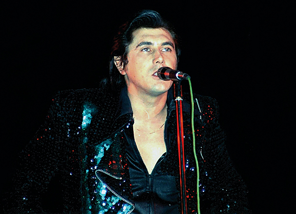
It was part of a carefully created audio-visual package masterminded by frontman Brian Ferry along with a team of keenly design-conscious associates. They knew the first full colour visual representation of the band that the public would see would be on the gatefold sleeve of their debut album. The debut they had self-financed and recorded before they were even signed. That whole gatefold sleeve was also conceived, designed and created before Roxy had a record deal, complete with effusive sleeve notes and parent-baffling portraits of the band members. It's another reflection of this band's unshakable self-assurance: enter Roxy, exit rock 'n' roll as you once knew it.
Shoot To Thrill
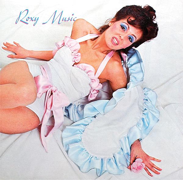
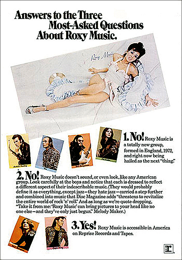
The cover of Roxy Music is a simple one – a pin-up-style photograph of model and former Bond girl Kari-Ann Muller (who would later appear on the sleeve of Mott The Hoople's 1974 album The Hoople) reclined on ruffled white sheets. (A bizarre rumour endured for many years that it was actually Ferry in drag.) Its apparent simplicity stood in contrast to the trends dominating rock cover art of the day. Cryptic, mysterious imagery was the popular option for many prog and hard rock bands' sleeves, custom-made for 'heads' to pore over while listening to the record, often full of obscure visual messages. Roxy instead aped an apparently long-outdated style – channelling the pin-up glamour shoots of starlets from the '30s, '40s and '50s.
'I was inspired, of course, by Hollywood', Bryan Ferry explained in a 2013 interview, 'but we always liked to think we were making something new out of that'. He had in mind the glamour of movie sex symbols such as Rita Hayworth, the damsel in distress (possibly concealing the femme fatale within), elegantly dishevelled yet unattainable, sensual yet mysterious.
As such, they were pioneering a retro-ironic, slighty kitsch style that would eventually become commonly employed, from boy bands dressing up as wartime crooners to Nirvana aping '60s beat pop combos in their videos.
Sweet Kari-Ann
Fashion designer Antony Price, who worked with Ferry from the early days and had a significant hand in shaping the band's visual style, said in 2017, 'It was meant to look like a Neapolitan ice cream'. Certainly the smooth pastel blues and pinks of the clothes worn by Kari-Ann Muller conjured up the look almost of a human confection, conveying a message that, when combined with the complex but racy hybrid of musical styles on the record within, suggested that this was a kind of meta-pop – pop about pop, post-modern and knowingly drawing on a pick 'n' mix grab-bag of styles.
Pop Art Meets Art Pop
Price had introduced Ferry to a valuable web of contacts in the fashion world that would be later referred to as 'the Notting Hill crowd'. As he explained in 2007, 'I was a rising star behind Ossie [Clark] so I had met all of his models… and Bryan would have met all of these people through me'.
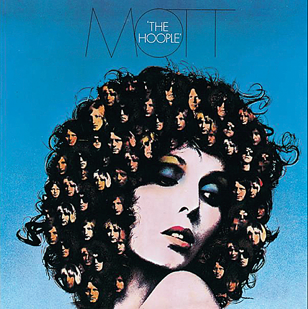
This new network was the source for an impressive team: as well as Muller, who was a friend of the singer (and was paid £20 for her trouble – the equivalent of around £250 today), Vogue photographer Karl Stoecker took the shots, while Price picked the model's clothes and his friend Keith Wainwright, from the ultra-chic Smile salon, styled the hair of Muller and the group.
Ferry's art school friend Nicholas De Ville, in collaboration with the singer, oversaw the overall look of the cover, 'assembling the ideas and getting rid of the bad ones', as he described it in 2019.
