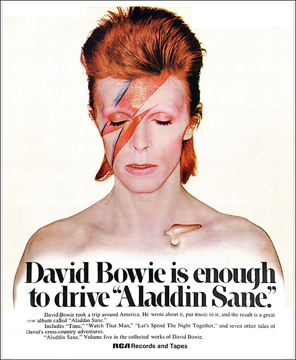
Under the covers... Aladdin Sane Page 2
Flash Of Inspiration
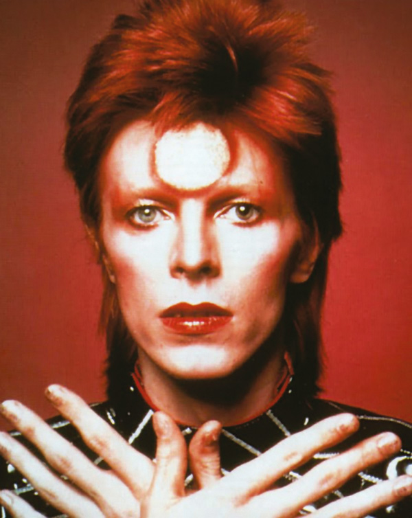
But that's not to detract credit from Duffy, the former fashion photographer who played a key role in firming up the visual elements. Duffy, who died in 2010, has said he believes that Bowie took inspiration for the flash from the ring Elvis used to wear with the 'TCB' acronym (standing for 'Taking Care of Business'). However, the zigzag was further inspired by a humble domestic appliance Duffy and make-up artist Pierre LaRoche had seen lying around in the photography studio. 'It was the trademark [logo] for National Panasonic – a red and blue zigzag that I took from a rice cooker', Duffy recalled in 2007. 'I drew the zigzag onto his face…'
Duffy's studio manager, Francis Newman, elucidated further when talking to AnOther Magazine: 'Pierre started to apply this tiny little flash on his face and when Duffy saw it he said, "No, not f*****g like that, like this". He literally drew it right across his face and said to Pierre, "Now, fill that in". It then took Pierre about an hour to apply properly. The red flash is so shiny because it was lipstick'.
Silver Lining
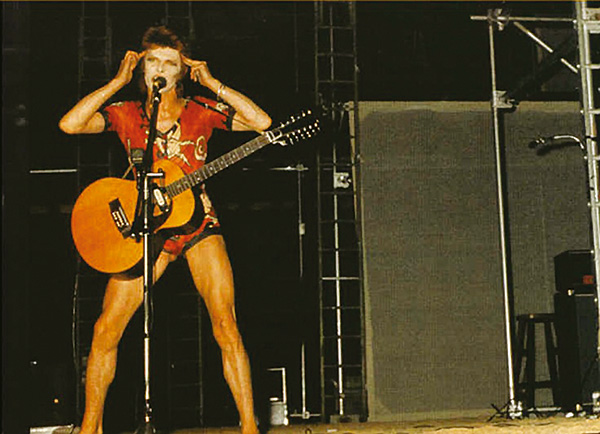
Other factors at work in this look and many others of Bowie's around this time came from his fascination with Japanese Kabuki theatre, which was a big inspiration for the fashion designer Kansai Yamamoto, who worked with Bowie on many of his Ziggy costumes, such as asymmetrical leotards, a silver example of which Bowie models on the gatefold of Aladdin Sane.
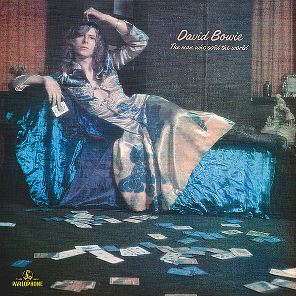
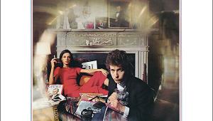
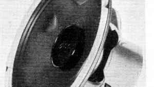
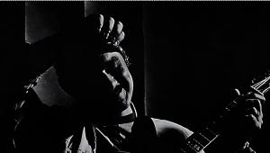
The photo that ended up being chosen was one from a contact sheet, some of whose shots see Bowie looking directly at the camera and some in profile. The one used turned out to be the only one in which he was looking down.
The Colours Of Money
For all that, the vibrant shades that shone out from record sleeves actually had a lot to do with the power games of Tony DeFries, Bowie's manager. DeFries was keen to make the record company take his client seriously, and to that end, he insisted the cover image be produced with an unprecedented seven-colour printing system, as opposed to the usual four. This, he argued, would optimise its visual impact on record shelves.
'I was looking for an iconic cover image and artwork that would help me to persuade RCA that Bowie was sufficiently important to warrant megastar treatment and funding', Tony Defries explained. 'Tony realised that, in order to get the record companies really going, you had to get them up to their neck in debt, which was, of course, a masterstroke', said Duffy in 2009. 'If it cost 50 quid… well, so what one way or the other. If it cost £5000, then the record company were now having to pay attention.
'The photograph would be a dye transfer, while to get the colour transparency onto paper at further outrageous expense, plates were ordered from Switzerland. And typesetting for the coloured name and title, [in Cristal font, typography nerds] was by Conways – again the most expensive,' Duffy added.
The result was reputed to have been, at the time, the most costly cover in pop history. But if you're going to push the boat out, you might as well get a lasting bang for your buck, and the way that sleeve has resonated down the ages is something that could hardly have been foreseen at the time.
SIGN OF THE TIMELESS 'To me, it was competent, very competent, but I wouldn't take it much beyond that', the ever-unexcitable Duffy said later. However, his designer colleague Celia Philo remembers taking a different view. 'When I first saw the contact sheets, I knew it was going to be a very, very powerful album cover. Time wise, it was pre-punk, it was pre- people walking down the King's Road with coloured hair and make-up on their face'.
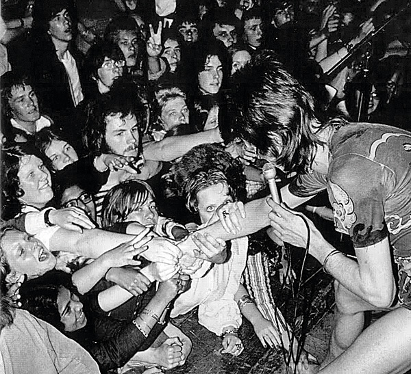
Oddly enough, the album shoot was the only time Bowie wore the flash design across his face, although it featured on concert backdrops. Unlike the astral sphere he had worn as Ziggy, it didn't end up as a part of his regular stage or photoshoot make-up – again, a reflection of not everything Bowie did being quite as clear-cut and controlled as his reputation would suggest.
Yet Duffy's son Chris reckons it's iconic enough to be compared to the ultimate artwork. 'Several years ago I started calling it the Mona Lisa of pop', he told AnOther Magazine. 'There isn't really an image that is as ubiquitous. It's been used on fridge magnets, caps, calendars, t-shirts, lighters, beer mats...'
And will we still be gazing at the image on the walls of galleries for centuries to come? Quite possibly.
|
| |||||||||


| Equipment Reviews | Music Reviews Awards | Latest News Features | Resources Newsletters | Subscriptions |
WHERE TECHNOLOGY BECOMES ENTERTAINMENT
 © 2026 Hi-Fi News
AVTech Media Ltd
All rights reserved