Under The Covers... Page 2
Talking Clock
The floral arrangement on the cover, according to McCartney, 'came from an idea which is a bit Northern and a bit to do with our childhood, which was to be a floral clock. I'd seen a clock all made out of flowers in the park. I wanted us to be above a floral clock being given a mayoral presentation, meeting the Lord Mayor of Halifax or something. Peter Blake started coming in with ideas, and the guys all came in, it got to be a think tank. Rightly so'.
One element McCartney has always been adamant about is that the leafy green plants at the feet of The Beatles were not what many fans assumed them to be. 'They weren't marijuana plants. They weren't. The florist just brought them in, but it got around that they were pot plants. They weren't. They were pot-plants not pot plants.'

Seeing Double
The cover was planned as a gatefold sleeve because The Beatles had hoped that Sgt Pepper's might be a double album. But when it became obvious they didn't have enough songs, Blake had to find some way to make use of the half of the sleeve that should have housed disc two.
The album 'ended up as only one record, but it was a double-sleeve', Blake said later. 'They thought that there would be more material but there wasn't enough for two records, so then we compiled this sheet of things you could cut out, the Sergeant's stripes and the like, for inclusion in one of the pockets.'
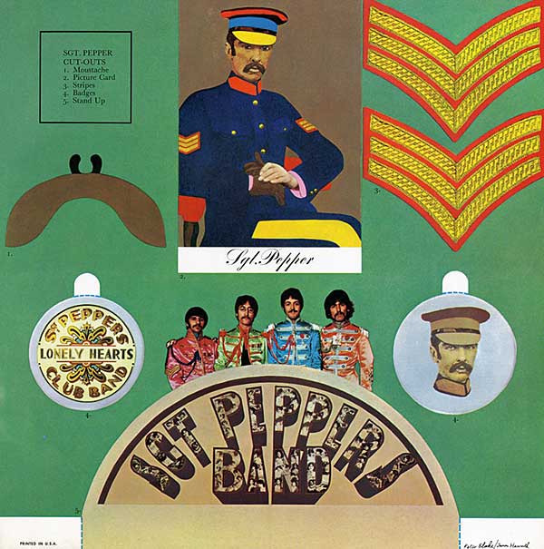
Inevitably, fans did as the band hoped they would, and cut out the stripes, the fake moustache, the period-style illustration of Sgt Pepper, the two badges, and a stand-up image of the band. A copy of the original album complete with Blake's cardboard sheet is now next-to-impossible to find and, of course its value will be dramatically increased.
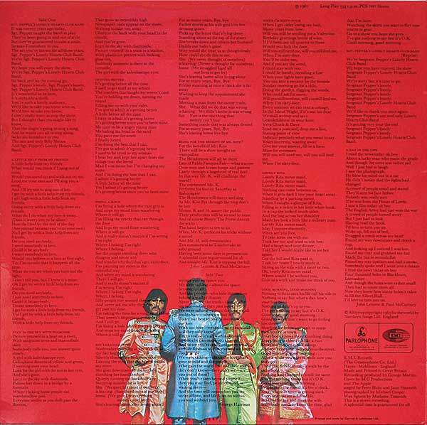
The cover also broke new ground by being the first to have the lyrics to all of its songs printed out in full on the rear, as well as the first to use colour not only on the front but on the back and on the interior gatefold, with its portrait of the group against a yellow background.
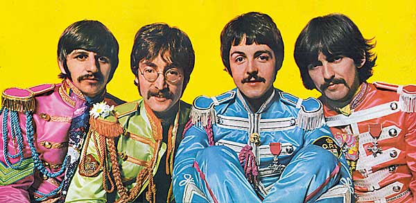
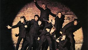
'One of the things we were very much into in those days was eye messages', McCartney said in 1997. 'So with Michael Cooper's inside photo, we said, "Now look into this camera and really say I love you! Really try and feel love; really give love through this! It'll come out; it'll show; it's an attitude". And that's what that is, if you look at it you'll see the big effort from the eyes.'
There is, however, an alternative interpretation of the message in the eyes of the group. Ringo Starr has suggested, 'Have a look at the sleeve, and come to your own conclusion! There's a lot of red-eyed photos around!' And John Lennon later went on to make Ringo's suggestion even clearer, stating that, 'If you look closely at the album cover, you'll see two people who are flying, and two who aren't'.

Even the album's inner sleeve, which housed the disc itself, was a significant departure from any that had preceded it. The standard in 1967 was a plain paper sleeve, but Sgt Pepper's boasted a unique, abstract pattern of red, pink and white waves, designed by hip Dutch design collective The Fool, named in reference to the Fool tarot card.
Pepper Parodies
The influence of the Sgt Pepper's Lonely Hearts Club Band sleeve on subsequent album covers is hard to over-estimate. Pearl Jam, The Rutles, The Muppets, The Simpsons, Big Daddy, Bob Newhart, Macabre and many others have based parodies and homages on the Pepper cover.
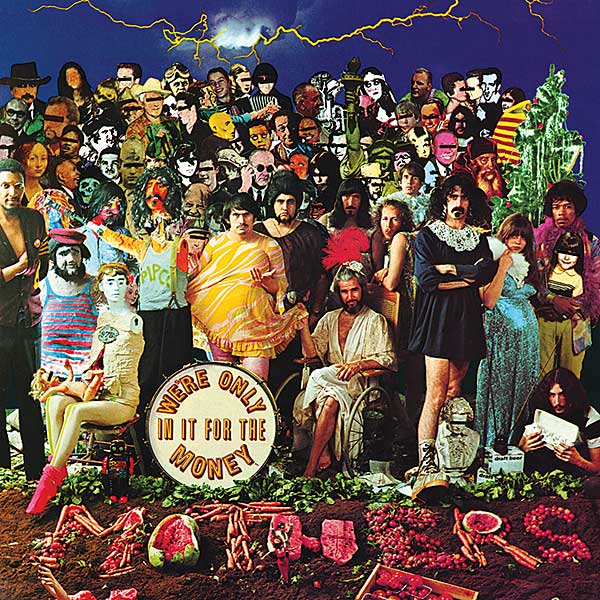
'There have been insulting parodies and there have been flattering parodies', acknowledges Blake, who was knighted in 2002. 'To this day, you'll see cardboard cut-outs with photographs which come from the Sgt Pepper's idea. Usually I'm flattered, but I think the one The Mothers Of Invention did on We're Only In It For The Money was spiteful. I have never liked Frank Zappa much.'


| Equipment Reviews | Music Reviews Awards | Latest News Features | Resources Newsletters | Subscriptions |
WHERE TECHNOLOGY BECOMES ENTERTAINMENT
 © 2026 Hi-Fi News
AVTech Media Ltd
All rights reserved