Look... hear?
Many years ago I saw a poster which showed a young woman in a wheelchair at the top of a flight of stairs that led down to a public washroom. The point being made was simple: she wasn’t disabled by being unable to walk. The problem was that whoever installed the facility had ignored the existence of people who found the stairs a barrier.
Long-term readers of Hi-Fi News may recall the work of people such as Fred Judd, or Angus McKenzie, that regularly appeared in these pages decades ago. Angus tended to specialise in areas like the performance of FM tuners, and was well connected with BBC engineers.
Manual Labour
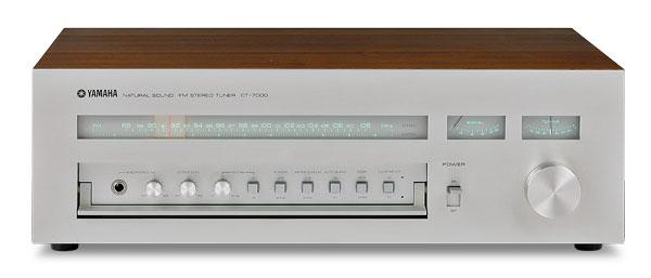
However, Angus had serious eyesight problems. It’s a matter of debate if that caused him to learn to listen with care, and thus develop his ability to assess sound quality. It was also perhaps a reason why he became a keen Radio Ham. This allowed him to have many helpful ‘chats’ via radio with engineers like Judd, Ted Rule of Armstrong Audio, and some of the BBC radio team. This would surely have come in handy when investigating the performance of a ‘super tuner’ like the Yamaha CT-7000 [HFN Aug ’12], when it became available in the UK.
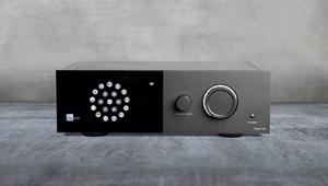
I thought of Angus a few days ago, when considering adding a product to my audio systems. I encountered some frustrating aspects of a unit that had nothing to with sound quality but, frankly, made it exasperating to use! In the end, I gave up trying and sent it back. I won’t name it because other products appear to be afflicted by the same sorts of ‘modern features’. But this won’t prevent me from giving vent to my opinion on such matters here.
The item was in a small case with minimal controls on the front. In essence, everything depended on the remote control. Nominally, it was very flexible, but complex to set up and use. Although a printed ‘manual’ was provided, this just contained a few small pages, in tiny type. It included a diagram showing the uses of the buttons on the remote, along with their icons. The printed text was also quite blurred. The maker’s website yielded a PDF file of the manual, so I printed a zoomed-in version to get text big enough for me to read with less effort.
I then wrestled to make sense of the menus, sub-menus, etc, that would allow me to set up the unit to operate as I wanted it to. One reason for this was that the device had a tiny screen on its front which showed the current state of where you were in the menu system.
Second-Class System
This display was, quite literally, about the size of a UK postage stamp. Furthermore, at any one time it was only able to show a portion of the options at the relevant ‘level’ I had reached. I did consider fishing out a magnifying glass, but I was also stumped by the difficulty of making sense of the ‘manual’, which I needed to keep re-reading as I went along.
After quite a lot of muttering bad words under my breath as I kept trying things and finding I’d got it wrong I reached a basic state for the device where it would do part of what I needed and this was memorised. It sounded pretty good. So I decided to celebrate by have a cup of calming Darjeeling First Flush Tea... and made a fundamental error. I switched the unit off!
Starting Over
After the cuppa I felt better and switched on again. I now found that the device was showing the basic menu and was no longer set to my choice of default operation. I had to navigate though the menus again using the remote control to have it resume playing the input I’d chosen. Faced with that, I decided to simply return the item to its makers.
The experience made me wonder how Angus might have reacted given that you aren’t meant to swear over the radio. Ergonomics, wot’s that?! Maybe every designer of consumer electronics needs a copy of that poster of the woman in the wheelchair on the wall above their workbench. It might help them keep real people in mind when designing new kit.

